Economist with over 25 years' experience as an investment strategist for both sell-side and buy-side firms and also a Certified ESG Analyst. A Christian working as a trustee involved in social outreach towards the homeless and those suffering from food poverty. Specific research interests around sustainability, with applications both to the environment and society.
Coming hot on the heels of the ECB’s climate change stress tests, Evergrande’s threatened default and possible debt restructuring expose some of the high-level challenges that may arise when economic policy seeks to counter the effects of unbridled expansion on environmental degradation.
“Where on earth are you getting that from?” you might well ask.
First, let’s be clear that Chinese policy concern over excessive debt accumulation long pre-dates the country’s recent decision to target net zero emissions. Entirely separate rationales can be identified for addressing the two problems; in particular, Kenneth Rogoff and Yuanchen Yang have recently exposed the stretched valuations in the Chinese housing sector based purely on conventional indicators.
Second, China is far from unique in the combination of increased indebtedness and an unsustainable ecological footprint. What makes it particularly striking is the rapidity and extent with which the two have developed. For example, Chinese nonfinancial corporate debt/GDP almost doubled from an already elevated 110% of GDP in the decade after 2007. Periods of accelerated debt accumulation are often associated with credit being extended further and faster than systems of governance, regulation or even market evaluation can keep up, increasing the chances of debt stress later.
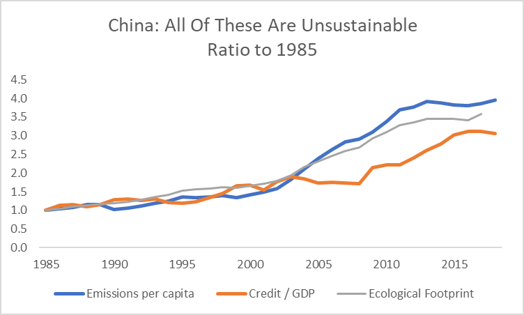
Despite these caveats, the reason for linking Evergrande with the ECB’s stress tests is the dual sources of leverage that have developed in China’s economy over the last twenty years: rapid economic expansion required the financing of large capex increases and encouraged expectations of future growth to become embedded in credit provision while, at the same time, the growth itself overloaded the country’s environmental capacity to sustain it, as shown in Global Footprint Network’s measure of China’s net biocapacity.
Source: Global Footprint Network
In cases like this, where assets are initially valued and credit allocated on the basis that the environment is a free resource, the imposition of an environmental constraint to economic activity through a policy target to reverse some form of environmental degradation may easily undermine the income and revenue expectations on which credit was provided. Moreover, the affected sectors need not be those most directly related to the policy constraint, but instead may be the ones where the build-up in debt was the largest and hence the likely sensitivity to changes in growth expectations highest.
Sources: Global Footprint Network; FRED: St Louis Federal Reserve database
The implication is clear: stress tests like those performed by the ECB that presume a VAT hike can be used to mimic the effects of a change in relative pricing may miss the (possibly more significant) system-wide nature of the economic adjustment to changes in economic and environmental constraints.
Viewed from a market practitioner’s perspective, conventional measures of financial leverage need to be enhanced to incorporate implicit environmental leverage, for example, through a measure of the beta of indebtedness at a corporate or sectoral level to emissions or environmental degradation. In practice, the most desirable measures of environmental degradation would be those most closely linked to that targeted for tighter environmental regulation.
To demonstrate with an example for China, we use an OECD report on sectoral debt accumulation and leverage, showing in the chart below a measure of the 5 year rolling sensitivity of leverage in selected sectors to increases in the level of environmental degradation.
Sources: OECD, Global Footprint Network
This exploration of implied financial leverage to the environment is very different from standard approaches to evaluating stranded asset risk which consider the scope for physical infrastructure to become unusable in the event that a binding carbon budget is imposed. Nonetheless, the underlying mechanism is the same – an environmental constraint is imposed which had not been factored into market expectations – and the applications to the assessment of market risk pricing are potentially significant as we enter a period where governmental environmental policy changes rapidly such that environmental constraints increase.
We draw together different strands of evidence that point to multiple dimensions of inequality stemming from a similar source. They start in product markets, extend through the labour market and cast across large parts of the financial markets.
A particularly pertinent conclusion is that it seems likely that, over the last decade, the dollar has benefitted from the same forces that have caused income inequality to increase.
The core pieces of evidence that we draw on are as follows:
The labour share has fallen, whilst measures of income and wealth inequality have increased;
The decline in the labour share can primarily be explained by an increase in market concentration rather than the behaviour of individual firms;
At the same time that market concentration, income and wealth inequality have all increased, so have measures of ‘equity market inequality’;
The US has increasingly been the primary beneficiary of these trends over the last decade, driving up the value of the dollar.
The first dimension: product markets
The starting-point for our analysis is two highly insightful pieces of work by David Autor and colleagues on the reasons behind the decline in the labour share over the last two decades (see the bibliography for details).
They demonstrate that the primary factor driving the decline in the labour share in the US is the competitive gain made by more capital-intensive firms. As these firms took market share, the overall contribution of labour to value-added / national income fell. They further show that the increase in market concentration as capital intensive firms dominated is not confined to one part of the economy, but instead broad-based. They use this analysis to motivate an economic model in which ‘superstar’ firms come to dominate the market, providing a range of possible explanations for why this might have come to pass.
The second dimension: the labour market
Autor et al’s work is most detailed on the US due to the limited availability of concentration data in other countries. Nonetheless, they argue that similar trends are likely at work elsewhere and that the decline in the labor share cannot simply be explained by increased trade, the decline in the significance of manufacturing, de-unionisation or other institutional factors that are sometimes used to seek to explain the trends in the labour share as well as income inequality.
Because our main focus is on the international transmission of this market change and because concentration data outside the US are limited, we do not seek to replicate their analysis of the change in market concentration. Nonetheless, as a reminder, in the charts below, we show the changes in US income and wealth inequality outright and relative to some of the other countries with comparable data.
Source: World Inequality DatabaseSource: World Inequality Database
The third dimension: financial markets
The link into market behaviour from this analysis comes from two papers written recently by Cliff Asness and his AQR colleagues (see the bibliography for details and links). They focus on a value-based strategy that systematically buys stocks trading at low price multiples relative to more expensive stocks. The motivation for this strategy has long academic roots and is viewed as one of the core ‘factors’ that delivers persistent returns – not just in equities but in a range of asset markets.
Asness shows that the valuation discount for stocks that would be bought as part of this systematic value strategy has, under a range of definitions, risen to historic extremes. Although the motivation for the AQR analysis is to argue that the strategy continues, in their view, to be an attractive one, for our purposes, we can extract some useful additional facts from their analysis:
Similar to the evidence from Autor’s work on concentration, the increase in ‘equity market inequality’ (i.e. the increased premium relative to a fundamental metric such as book value, sales or earnings for the most expensive stocks relative to cheaper stocks) is widespread and not isolated to, or explained by, a single sector;
Similarly, it is not restricted to one specific metric, but broadly based;
Although the periodicity of the ‘equity market inequality’ metric is extremely high compared with the data on inequality or market concentration, from Asness’s charts, we can nonetheless see the same broad drift towards inequality on this metric (starting in the late 1970s or early 1980s) as for measures of income inequality or market concentration.
The link this suggests to the analysis presented by Autor et al is both simple and powerful: at the same time as market concentration has increased, the equity market has been increasing the premium at which it is willing to buy the stocks of market-leading companies: investors have become increasingly convinced that today’s winners from market concentration will remain winners in the future.
As we show below, this has been particularly true over the last decade. This naturally generates two questions:
Are the factors generating market concentration ones that are sustainable or in any way predictable?
Are other assets affected beyond the equity market?
The determinants of the rise in market concentration are discussed by Autor et al without it being the primary focus of their work. They argue that there might be a benign explanation, with increased returns to scale prompting the initial gains in market share while rapid innovation and productivity gains could be required to sustain it. However, they acknowledge the possibility of a less benign rationale, where barriers to competition allow market leaders to extract oligopolistic rents, with the market becoming increasingly willing to discount those rents into the future.
Broad evidence on this is less readily available, but Simcha Barkai (see bibliography for details) argues that the capital share (as distinct from the profit share) has fallen at the same time as the labor share, which makes a less competitive outcome likely.
If correct, changes in political attitudes towards competition policy – particularly in the US but also in other countries – that cause the market to downgrade expectations of the sustainability of “winners’ earnings potential” will feed through not only to equity multiples but have a broader impact on asset allocation.
In considering the further ramifications of the increase in concentration and ‘equity market inequality,’ the one that immediately stands out is the way in which the US has been a winner from increased inequality both in equities and FX over the last decade. Taking earnings expectations as a smoother proxy for actual earnings, the chart below shows the extent to which the US has persistently outperformed the global equity market since 2011.
The two charts below show the linkage between p/e multiples across countries and the richness of the dollar:
The upper chart compares the multiple of price to expected earnings for the S&P 500 relative to MSCI World alongside the IMF’s measure of the USD real exchange rate;
The lower chart – at much reduced periodicity – compares relative p/e spreads and the deviation from purchasing power parity for an equally-weighted basket of G5 currencies – a GDP-weighted basket is similar, chart available on request.
SPX – MSCI World p/e spread vs USD real exchange rate; Source: Bloomberg Unweighted average FX deviation vs PPP and p/e spreads for US vs EUR, JPY, AUD, CAD, GBP: p/e spreads shown are annual averages; Sources: OECD, Bloomberg
We can conclude that market concentration, income inequality and the dispersion of equity market multiples have all increased over the last two decades. Companies quoted on US equity indices have been the primary beneficiaries from the increase in market concentration, attracting capital inflows in a way that has caused the dollar to appreciate.
Long-running trends always deserve respect: their robustness generally requires a significant countervailing force to cause them to reverse course. The counterpart, however, is that as the driving-force behind a trend impacts a wider range of assets, it typically loses intensity and becomes more vulnerable, both to economic competition and to the political process.
The commentary contained in the above article does not constitute an offer or a solicitation, or a recommendation to implement or liquidate an investment or to carry out any other transaction. It should not be used as a basis for any investment decision or other decision. Any investment decision should be based on appropriate professional advice specific to your needs.
The first set of recommendations from economists in response to the COVID-19 crisis saw a broad consensus that can be summarized as:
Act fast,
Do whatever it takes,
‘Flatten the recession curve’ [Baldwin and di Mauro, 2020].
In the midst of a very broad range of possible outcomes, the debate on how to foster a sustainable recovery has been striking for the prominence of policies with the double merit of boosting growth and the economy’s capacity to grow whilst reducing CO2 emissions. The below summarises the main themes with a slight bias towards the UK, but with broad application.
The impact of the crisis
All crises leave scars:
Balance sheets: the accumulation of debt by governments, businesses and households is inevitable; the presumption is that in contrast to the post-2008 crisis, governments will seek to grow out of the current / coming debt accumulation or perhaps find new approaches to taxation rather than repeat the post-2008 spending restraints that tended to exacerbate inequalities [Haldane in Stern et al, Strategy…, 2020];
Behavioural: absent strong direction from the public sector, the expectation is of a highly conservative private sector response to the shock (increased desired savings, etc) [Haldane, ibid];
Changed social contract [Chater and Delaney in Chater et al, 2020] with increased concern over how people are disconnected from society [Larden in Chater et al, 2020];
Complex systems that have been ‘jumbled up’ are unlikely to return to their previous state [Hahn in Chater et al, 2020].
In no way was this a typical economic downturn:
Deliberate inducement of the recession for public health purposes [Tenrayo in Velasco et al, 2020];
Simultaneous implementation of programmes to stabilize businesses through loans, cushion income losses, prevent normal creditor reactions to credit payment interruptions and preserve worker-firm matches [Blundell, 2020] as well as massive monetary stimulus to underpin liquidity;
Very little moral hazard [Tirole, 2020]
COVID-19 likely to exacerbate existing inequalities and create new ones:
Inequalities were evident in many economies across, for example, income, education, race, sex [focusing on the UK as an example, Blundell, ibid]. In the US, as a less frequently observed example, suicide risk since 1995 has increased ‘almost exclusively’ amongst those without a college degree [Deaton, 2020];
Healthcare inequalities and social insurance limitations act as a fault-line in the US [Stiglitz, 2020];
Access to education has been highly (undesirably) stratified during the lockdown, with likely long-lasting impacts [Blundell, ibid];
In developing countries, there is a clear risk of undoing a decade of progress in taking people out of poverty and a possibility that the lockdowns have as severe an effect on health as the virus itself [Khan in Velasco et al, 2020].
Increased incentives to substitute Capital for Labour:
The digital investment catalyst ‘just happened,’ reflecting the inability to run businesses in its absence [Haldane, ibid];
Reassessment of the infrastructure and management costs needed to support office-based and home-working as well as the expectation of increased illness [Haldane, ibid];
Expect a significantly negative impact on social mobility, with a high priority for policy to prevent new rounds of long-term unemployment [Machin in Stern et al, Policy… 2020];
Aggressively subsidise labour demand as an immediate response [Velasco in Stern et al, Policy… 2020].
Policy constraints:
Expectations for policy constraints in the period after the immediate recovery:
High public debt: whilst growing out of it sounds great, what is the policy mix that creates success where previously there has been none? In response to high debt, governments either raise taxes above spending or depress interest rates below growth rates [Reis in Velasco et al, 2020];
Poor productivity: possible contributions through monopoly power (via under-investment) and the misallocation of investment (abundantly clearly through CO2 emissions, perhaps also zombie companies sustained by ultra-low interest rates) [Reis, ibid]
Tirole [ibid] proposes five scenarios for the policy response to high debt:
Run primary surplus;
Restructure debt;
Exceptional wealth taxes, either on households or (with high risk in the euro area) banks;
Debt monetisation, with the risk of raising inequality through the impact of inflation on those without employment income or with only nominal assets as savings;
Collaborative stimulus measures that
Policy Themes
Resilience
Increasing resilience has to be a core policy focus [King, 2020];
Address widespread policy myopia likely requiring increased investment at the expense of consumption [Tirole, ibid]
Investment in social and institutional capital to deliver functional government [Zenghelis in Stern, Strategy… 2020] but not in a traditional centralized system [Rajan 2020; Coyle in Stern, Policy…, 2020];
Public goods that are privatised become potential sources of fragility [Deaton ibid, Stiglitz ibid];
Yet, the private sector can have a core role in enhancing resilience and public sector capacities [Romer, 2020] as witnessed by the contribution of private laboratories to greatly expand Germany’s testing capacity;
‘Reshoring’ does not equate to resilience [Tirole, ibid]
Strengthen labour markets to cut short negative feedback loops:
social insurance,
skills agenda for green transition;
human capital tax credits;
improve demand/supply matching information/coordination in local labour markets [Blundell ibid, Machin ibid];
Simply rebuilding businesses with pre-crisis exposure to climate change would be a catastrophic failure to improve resilience – see below.
‘Build back better’
Stern et al’s motivation [Stern, Strategy…, 2020] for focusing policy efforts comes from an assessment of woeful productivity, inadequate investment, the experience of austerity as a catalyst / amplifier for increased inequality, regional inequalities, under-investment in natural and social capital as well as an emphasis on the labour skills required for the green transition;
Survey responses compiled by Hepburn et al emphasise the desirability of five types of policy:
Clean infrastructure;
Building efficiency retrofits;
Natural capital;
Education and training;
Clean R&D.
For a discussion of building energy retrofits specifically and system complexity from an engineering perspective, more generally, see Mayfield 2020.
Accelerate investment required to render a sustainable recovery
Directly targets the inadequacy of investment in the last cycle, provides an immediate source of demand stimulus and employment whilst also providing a CO2-reducing supply boost if correctly targeted [Zhengelis, ibid];
IMF and OECD estimate investment multipliers of 2.5-3x the size of the initial investment [Llewellyn in Stern et al, Strategy…, 2020];
Infrastructure investment has the capacity to crowd-in private sector investment through network effects and concentrate private sector expectations around climate change objectives in ways that other policies cannot [Grubb 2014, Zhengelis ibid];
It can be combined with revenue-raising / redistributing policies that reinforce the shift to cut carbon emissions [Burke et al, 2020];
It pushes on an open door in that the cost of capital has already shifted dramatically against carbon-intense activities.
We consider the utility of the real forward exchange rate as an investable valuation metric, focusing on a number of EM Latin American countries to demonstrate the application of the concept for a USD or GBP-based investor. We show why we think the metric is useful both as a gauge of all-in risk premiums, a guide to the timing of investments and as a way to consider the appropriate risk bucket for the underlying assets.
The real exchange rate adjusts for changes in the general level of prices between countries, thereby providing a tractable benchmark for currency pairs affected by a persistent imbalance in the level of inflation. In the same way that a forward exchange rate discounts interest differentials between countries over a certain period of time, a realforward exchange rate can be constructed using the combination of the real exchange rate and real interest rate differentials.
The chart below shows the concept for USDBRL. We rebase the spot real exchange rate to equal 100 in 2004, generating a real forward exchange rate based on the compounded real interest rate differentials between Brazil and the US.
USDBRL: real exchange rate, real yield spreads and real forward exchange rate; Source: Bloomberg
At any point in time, what the measure captures is the ability for a holder of an inflation-linked bond in the US to sell the bond, exchange the dollar proceeds for Brazilian real and to use those proceeds to buy a Brazilian inflation-linked bond. The investor is compensated for increases in Brazilian CPI for the remaining lifetime of the bond, providing something of a cushion against declines in the nominal exchange rate, with the higher level of real yields compensating for a combination of higher default risk, greater return correlation to risky assets in economic downturns as well as the risk of a depreciation of the real exchange rate before the principal is repaid.
Although this is the purest application of the concept, regulatory constraints on many holders of inflation-linked bonds reduce the number of investors who would consider this type of transaction in practice. We therefore complement it with a simpler variant in which we show the combination of the real exchange rate and the real yield of the higher-yielding market. The resulting hybrid measure shows the protection for a cash investor in the lower-yielding currency assuming that their investment alternative would be to hold a zero real-yield asset in their domestic currency. In practice, this might either be too low or too high, depending on the domestic monetary policy regime in place, but the approach has the merit of isolating the contribution of the higher yielding asset to the investment decision. We label this hybrid measure ‘cash investor’s protection’ in the charts below.
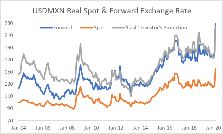
In the chart below, we show the application of the two concepts to USDMXN. The impact of the US monetary policy regime on the difference between the real forward exchange rate and the ‘cash investor’s protection’ is readily apparent: prior to the 2008 crisis when US real interest rates were consistently positive, the assumption of zero US real interest rates in calculation of the ‘cash investor’s protection’ has the effect of boosting that measure well above the forward. By contrast, post-crisis, with US real interest rates close to zero most of the time, the difference between the two metrics has typically become relatively modest.
USDMXN real exchange rate and two alternative forward measures: see text for details; Source: Bloomberg
In the UK, because the impact of regulation on investor behaviour has become increasingly influential in depressing inflation-linked yields relative to other countries, the difference between the two measures has, by contrast, become increasingly substantial.
GBPMXN: real exchange rate and two alternative forward measures – see text for details; Source: Bloomberg
The chart above is also notable for the fact that the GBPMXN real exchange rate has exhibited far greater stability than the USDMXN real exchange rate.
We consider two primary drivers of the real exchange rate: the first is productivity, given the expectation that low income countries will experience faster domestic services inflation as their productivity rises and income levels converge with higher income countries; the second is current and expected terms of trade, particularly for countries with high exposure to commodities.
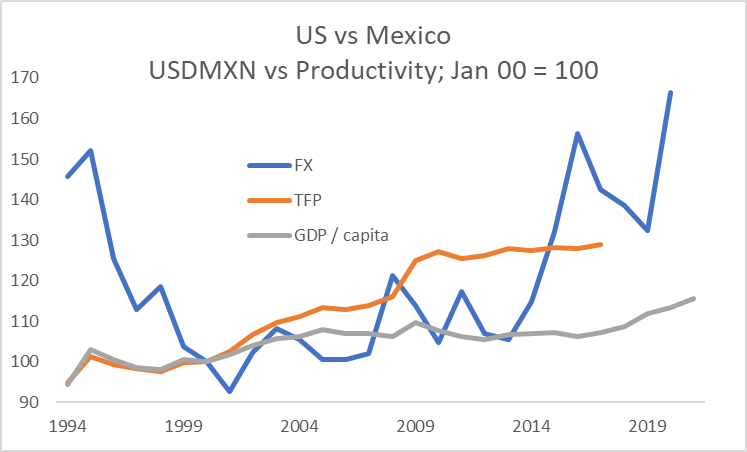
The chart below compares the USDMXN real exchange rate with two measures of productivity: the first is based on Total Factor Productivity growth differentials as reported in the Penn World Tables while the second shows changes in GDP per capita at PPP exchange rates, as reported by the IMF.
US vs Mexico: real exchange rate and productivity measures; Sources: Bloomberg, Penn World Tables, IMF
Depending on the metric used, over the period since 2000, the US has seen an improvement of productivity versus Mexico of 15-30%. As of the end of April 2020, the USDMXN real exchange rate had appreciated by just over 65% since 2000. The extent of the peso’s depreciation likely reflects some combination of market judgment that sustainedly lower oil prices may require a weaker Mexican real exchange rate relative to its historic level as well as the discount required on all riskier assets during a period of extreme uncertainty over activity and income levels.
We show two ways of evaluating performance.
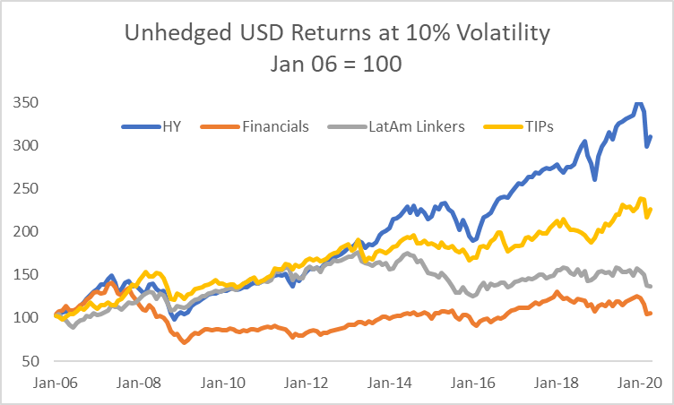
For the first, we construct an equally-weighted index based on Mexican, Brazilian and Chilean inflation-linked bonds, using the returns from the Barclays indices. Considering all the assets at 10% volatility, we then compare the returns with US TIPS, US High Yield credit and the MSCI World financials index, all expressed in unhedged USD terms.
LatAm inflation-linked bond unhedged returns in USD compared with selected assets; Source: Bloomberg
We can make three clear observations from the returns history:
All of the assets saw a substantial repricing during the 2008 crisis; in contrast to the others, global financials struggled to recover as capital needs and the regulatory costs associated with the business increased (less apparent from the chart but nonetheless the case is that LatAm linkers have delivered a similar return profile at 10% volatility to global financials since 2016);
Until 2013-2014, the return profile for LatAm inflation-linked bonds in USD terms was readily comparable with US High Yield and TIPS; the subsequent bifurcation likely reflected a combination of (I) the end of China’s commodity binge, (II) the oil market collapse in 2015; (III) Brazil’s financial crisis, and (IV) the upward shift in USD real rates and the dollar itself as the Fed moved away from emergency settings for interest rates and US fiscal policy become highly stimulatory under President Trump;
Even allowing for the occasionally large drawdowns, the returns from leveraged US credit have been competitive with almost all other major asset classes through the period.
Instead of constant exposure to the asset class, we now consider the merits of using the forward real exchange rate as a valuation indicator. In the charts below, we show two different investment cases for a USD-based and a GBP-based investor:
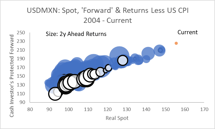
In the first case, we show unhedged Mexican inflation-linked bond returns less US or UK CPI relative to the real spot exchange rate and the ‘cash investor’s protection’ rate as an indication of whether Mexican inflation-linked bonds delivered a positive return in real USD or GBP terms over the subsequent two year period (we selected two years in all cases as an indicative period for mean-reversion of the real exchange rate and reduction in risk premiums through the cycle, making no attempt to optimise the holding period);
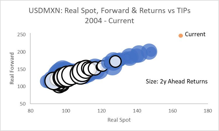
In the second case, using the real spot and forward exchange rates, we consider the more challenging hurdle of whether Mexican inflation-linked bonds outperformed domestic inflation-linked bonds over the subsequent two year period.
The two charts below show the case for a US-based investor. The blue bubbles indicative a positive return over US CPI for a USD-based investor, the white bubbles a negative return. Given a two year investment period, the clear indication from the chart is that the combination of the real spot and forward rate helps to identify the conditions under which positive returns in real USD terms are more likely to be delivered. The ‘Current’ point in each of the remaining charts refers to end-April 2020.
Unhedged USD returns for Mexican inflation-linked bonds; see text for details; Source: Bloomberg
By contrast, it is less apparent whether the construct is useful in identifying whether Mexican inflation-linked bonds will outperform TIPS in unhedged USD terms.
Return comparison: Mexican inflation linked bonds less TIPS; see text for details; Source: Bloomberg
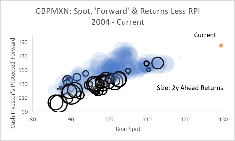
These conclusions are reinforced when extending the analysis for a GBP-based investor.
Because the GBPMXN real exchange rate has been largely stable, the combination of the real spot and ‘cash investor’s protection’ rate have helped identify the conditions under which Mexican inflation-linked bonds are likely to deliver a positive return in real GBP terms over the subsequent two years.
Unhedged GBP returns for Mexican inflation-linked bonds; see text for details; Source: Bloomberg
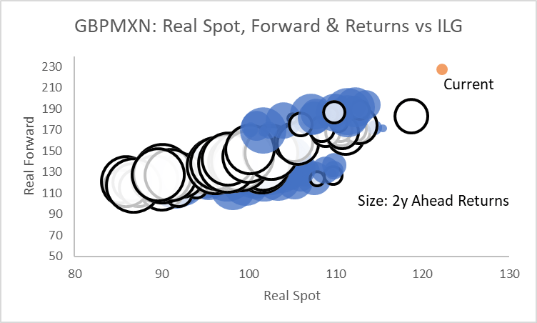
However, over the period considered, it has almost always been a losing proposition to sell inflation-linked gilts relative to Mexican inflation-linked bonds, regardless of the starting-point for the real exchange rate.
This analysis helps draw out a number of different components of the investment decision for EM inflation-linked bonds:
EM inflation-linked bonds can deliver competitive returns for foreign investors;
However, for many G10 investors, they are best considered as part of the risky asset bucket – they cannot compete with long duration domestic bonds in an environment of deteriorating growth;
Similar to risky assets overall, a dynamic approach is best in determining the appropriate level of exposure through the cycle;
Analysis of the real exchange rate and appropriately-defined forwards has historically helped define the conditions under which these assets are most likely to perform;
Nonetheless, this does not do away with idiosyncratic policy decisions or risks from sudden institutional changes;
Looking forward, an investor’s judgment on the drivers of the real exchange rate and the outlook for an individual country’s creditworthiness can be used to help determine whether the compensation for risk offered by current entry points are sufficiently attractive or not.
The commentary contained in the above article does not constitute an offer or a solicitation, or a recommendation to implement or liquidate an investment or to carry out any other transaction. It should not be used as a basis for any investment decision or other decision. Any investment decision should be based on appropriate professional advice specific to your needs.
A brief annotation of the bifurcation between April’s market recovery and the underlying deterioration in fundamental conditions, summarised in six charts.
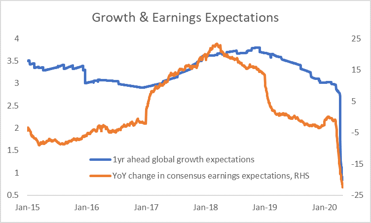
The underlying hit to growth expectations continued to build as the first post-lockdown data were released.
Consensus forecasts: 1y ahead global GDP growth and corporate earnings; Source: Bloomberg
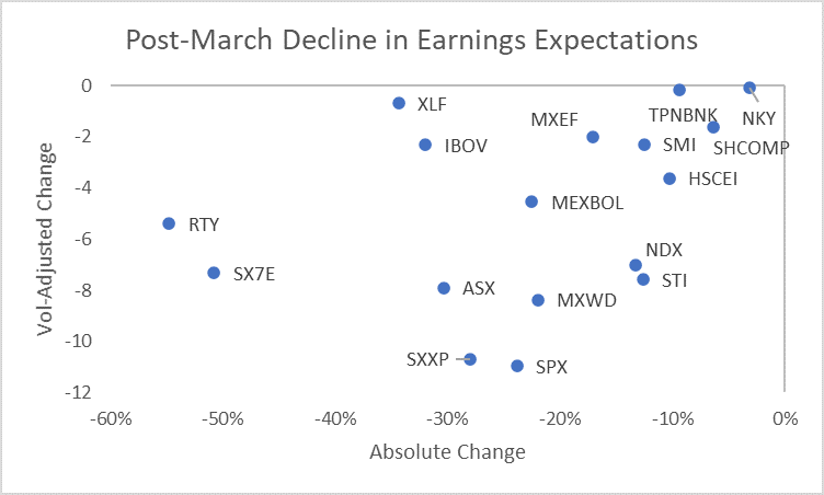
Since the beginning of March, the change in earnings expectations has been particularly severe for US cyclicals and European banks. Adjusted for the longer term volatility of expectations, the change at the broad index level in the US and Europe has been greatest.
Change in 1y ahead earnings estimates since March 1 2020 in absolute terms and adjusted for post-2005 monthly volatility; Source: Bloomberg
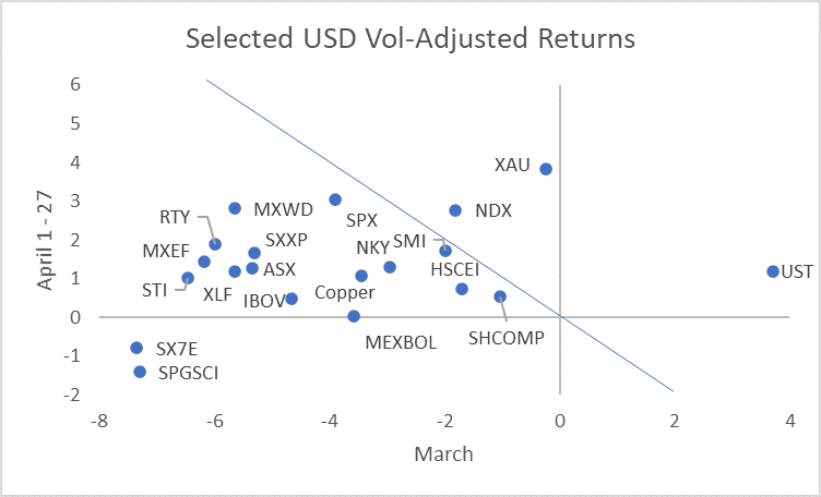
The market traded liquidity in preference to fundamentals in April. Looking at performance across March and April, the clearest beneficiaries from central bank liquidity were Treasuries, long duration equities (last cycle’s winners) and gold. Commodities and European banks failed to benefit much if at all.
Unhedged USD returns adjusted for 2018-2019 volatility; Source: Bloomberg
The effects of the central bank liquidity injections and asset purchases on the demand for protection against further asset market shocks was evident in the large-scale retracement of the earlier surge in implied volatility. The chart shows the cumulative Z-score based on data since 2001.
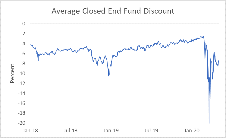
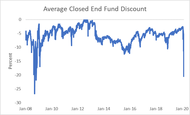
Other measures of liquidity risk in many cases improved further. Our measure of the closed end fund discount has not fully recovered from its March collapse, but has returned to levels that suggest much greater confidence in the pricing of assets and the ability to generate cash from less liquid holdings if required.
Average Closed End Fund Discount; see text link for details of construction; Source: Bloomberg
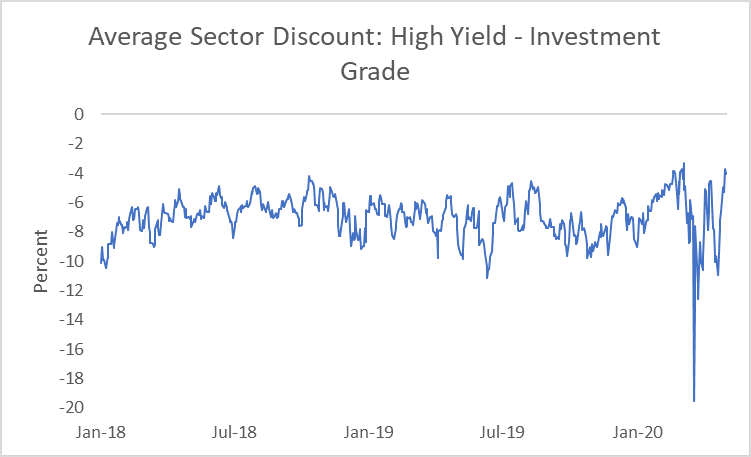
The effects of the Federal Reserve’s interventions were particularly notable in the US High Yield market to the extent that the discount for funds in that sector relative to Investment Grade funds is now towards the tightest it has traded at since 2015.
Average sector discount for High Yield less Investment Grade closed end funds; see link in text for construction details; Source: Bloomberg
We explore the merits of different approaches to tracking carbon as a source of returns in a macro portfolio, concentrating on equity and FX markets.
Whereas the sector concentration of CO2 emissions makes it relatively easy to identify a high-level carbon factor in equities, FX is more challenging. We expose the ways in which construction of a carbon FX portfolio requires the integration of EM currencies and therefore careful risk management of non-carbon factors.
Our intention is to build towards a cross-asset expression of carbon in a macro portfolio. The approach we use is to identify summary financial exposures that an investor can monitor in expressing carbon as a theme and to define those exposures parsimoniously.
In starting, we summarise the building blocks we use in constructing a theme using asset returns:
Themes are designed to give constant exposure to a driver of asset returns;
They an be comprised of outright or long/short asset exposures;
They are constructed such that each exposure has 10% volatility to prevent returns from higher volatility assets dominating the signals from lower volatility assets;
The investor has constant exposure to a theme regardless of prior losses or profits made;
Representations are designed to be generic to capture the essence of the return stream rather than favouring niche expressions that may be dominated by idiosyncratic factors.
Taking a well-known example in the form of cyclical assets to demonstrate one set of applications of the approach:
Cyclical upswings are periods of increased economic optimism, rising demand for capital and growing willingness to take market risk;
Hence, in a cyclical upswing, real interest rates would typically be expected to come under upward pressure;
Inflation expectations generally rise in phases of cyclical strength;
Equities would usually be expected to outperform bonds;
Credit spreads would normally compress;
High-yielding currencies would typically outperform low-yielding currencies.
Hence, in the cyclicals theme whose returns we show later, the investor is short inflation-linked bonds, long breakevens, long equities versus Treasuries, long credit, long the cyclical component of the equity market as well as long high-yielding currencies funded in safe-haven currencies. This is not necessarily the best combination for all cyclical upswings or indeed all parts of an upswing. However, it serves to capture a generic cyclical momentum across markets.
Taking this as a base, what considerations should inform our thinking about carbon in a macro portfolio?
Although policy change to achieve carbon-reduction targets over time could have very significant implications for asset allocation decisions and desired country exposures, we think it easiest, in the first instance, to consider carbon as a relative price factor;
In particular, policy is increasingly oriented towards encouraging the market to devalue activities that are intense in carbon production relative to those that are not;
Hence, we focus on a series of long/short exposures: investors are long low carbon-producing sectors relative to carbon-intense sectors while being long currencies of low emitters or of economies in which activities have adjusted to a price of carbon consistent with public policy objectives;
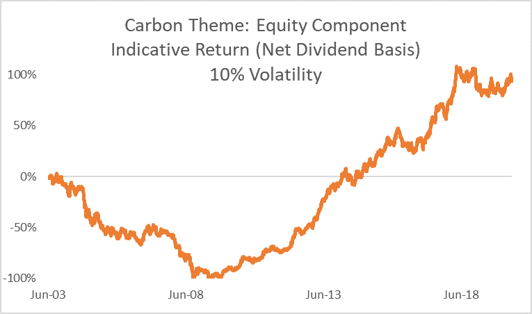
We use OECD data to isolate the carbon intense sectors (utilities, oil and gas along with metals and mining) and define exposure such that the investor is short those sectors relative to the MSCI World.
The chart below shows the summary return stream from this long/short equity exposure:
Returns from the equity market versus high carbon assets; see text for details; Source: Bloomberg
The chart identifies two very distinct periods for the exposure:
Through the commodity super-cycle, the strategy was disastrous: the strength of China’s demand for commodities caused the market to judge that income streams from carbon-producing sectors were increasingly valuable, the opposite of what the strategy seeks to gain exposure to;
By the start of the 2010s, however, the cycle turned and, as China’s dash for commodity-intensive growth abated, so did the relative weight of carbon-producing sectors in global equity markets;
The result was a return history for the strategy of large extremes.
To identify potential candidates for expressing the same theme in FX, we adopted a metric based on CO2 emissions relative to per capita GDP. The chart below shows, for selected countries, that the relative country rankings are stable even though the overall level of emissions per unit of GDP have trended lower.
Carbon emissions per capita / GDP per capita; ranked versus UK 2010; see text for details; Source: OECD
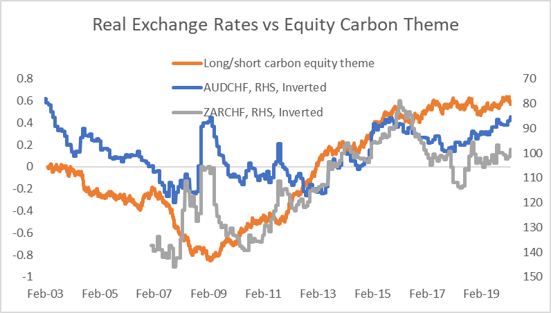
Taking the extremes from this group of countries to allow a long/short portfolio to be structured, we first consider the relationship between the relative price of carbon as measured by equity market returns and FX.
CPI-based real exchange rates (Jan 2014 = 100) versus carbon equity theme returns; Source: Bloomberg
The chart shows that there is a long run relationship between the real exchange rates of the chosen pairs and the equity theme. Indeed, this is a well known channel in FX analysis: given that both Australia and South Africa are commodity exporters, while Switzerland is a commodity importer, we would expect that the equity returns embedded in the carbon equity theme would act as a proxy for the terms of trade in commodities.
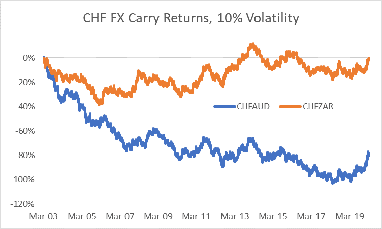
Regrettably, this is not sufficient for the construction of a profitable FX strategy, however. As shown in the chart below, the persistently higher level of interest rates in Australia and South Africa compared with Switzerland either neutralise or dominate the prospective long run return stream coming from the relative pricing of carbon.
FX carry return for strategies long CHF versus short AUD and ZAR, respectively; Source: Bloomberg
We adopt two approaches in seeking to address these problems:
We use more recent and detailed metrics for assessing countries’ carbon exposure; and
We actively seek to control for non-carbon risks using a portfolio of both developed (DM) and emerging market (EM) currencies.
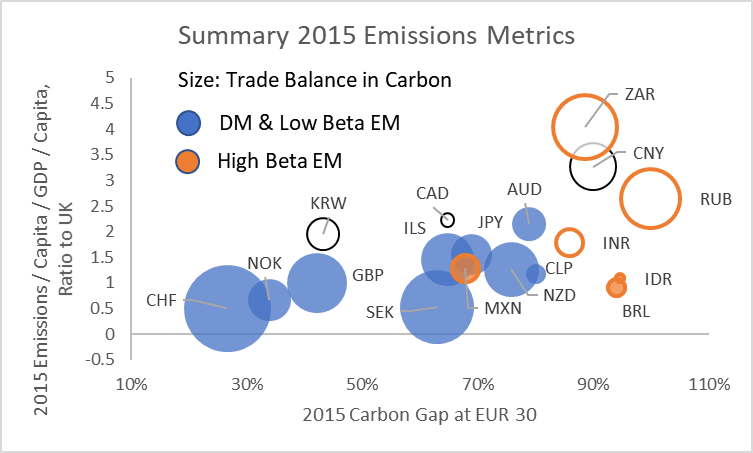
The chart below summarises a number of metrics compiled by the OECD on carbon emissions.
CO2 emissions on various OECD metrics – see text for details; Source: OECD
The chart displays the following:
The x-axis shows the OECD’s measure of the carbon gap: a way of measuring the proportion of economic activity within a country that reflects carbon prices at or above certain levels judged to be consistent with long run climate pledges – the lower the gap, the more competitive is economic activity in a country assuming that carbon prices adjust to the level required to contain global warming;
The y-axis shows emissions per capita, with all countries shown as a ratio to the UK purely for the purpose of easy visual comparison;
The size of the bubbles shows the OECD’s estimate of whether a country is a carbon exporter (bubbles with a white centre) or importer (coloured) as embedded in the goods it trades – the size of the bubble shows the size of the country’s exposure to net trade;
Finally, we distinguish high beta EM currencies from other currencies because they typically suffer both weaker currencies and higher interest rates in a period of risk aversion, thereby creating a higher volatility return structure.
How might we consider these metrics in forming a carbon FX portfolio?
First, early adjustment to higher carbon prices should, in principle, be a source of competitive advantage, with those countries standing to benefit as policies in other countries converge over time;
Second, large net exporters of carbon embedded in goods trade are prospectively particularly exposed to changes in other countries’ policies regarding carbon pricing, eg through carbon border taxes;
Third, any meaningful FX portfolio exposure to carbon needs to consider how to manage EM risk.
In addition to these considerations, the approach we take seeks to adjust to the natural grains of the FX market:
We select currencies such that the portfolio has no net dollar exposure given the dominance of the dollar factor in pricing currency risk independent of carbon exposure;
We seek to limit exposure to managed currencies and in particular elect not to include China in the portfolios because of the amplified effect its currency moves can have on other EM currencies;
We seek to balance out risk exposure between currency pairs with otherwise similar risk exposures, eg to safe haven flows, carry, cyclical risk or EM beta risk;
Nonetheless, investors should bear in mind that EM assets naturally reflect a higher level of idiosyncratic risk than DM and that this may periodically overwhelm the desired carbon exposure.
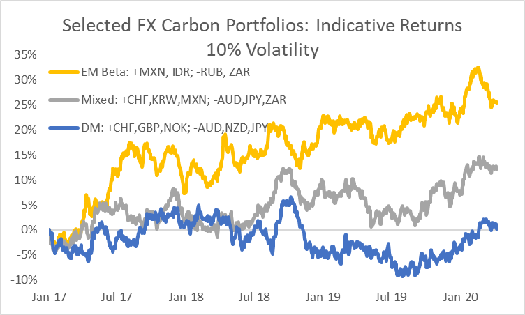
The chart below summarises the performance of three different portfolios. The portfolios are based on slow-moving information that is published with a long lag, hence returns should be treated as purely indicative, with the merit of the inputs in selecting currency exposure better gauged over the coming economic cycle. Some investors may seek to implement an active management overlay to allow, for example, within-bucket risk reallocation based on other valuation metrics whilst retaining the same directional exposure to carbon.
FX long/short carbon portfolios – see text for details on construction; Source: Bloomberg
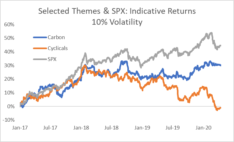
Finally, we combine the mixed FX portfolio with the equities carbon theme shown above to demonstrate the concept of a cross-asset carbon theme, comparing the resulting return streams in comparison with our cyclicals theme and the S&P 500, all at 10% volatility.
Returns to selected themes and the S&P 500 at 10% volatility – see text for construction; Source: Bloomberg
Two charts summarise the extreme destruction of value seen in March.
March Local Currency Returns – see text for details; Source: Bloomberg
The first chart shows the local currency returns of a selected sample of assets across fixed income, equities and commodities. Fixed income returns are from Barclays’ indices, while all other assets are shown with their Bloomberg tickers for convenience. Returns shown are in local currency terms (in USD for commodities).
The chart reveals two key features of March’s shock:
The imbalance between the number of assets generating positive returns and those suffering losses: safe havens were few and far between and, for the month as a whole, provided a very modest offset against the losses elsewhere;
The severity of the losses for commodities and commodity producers, bank stocks as well as cyclical assets which had been priced for growth (eg RTY: the Russell 2000).
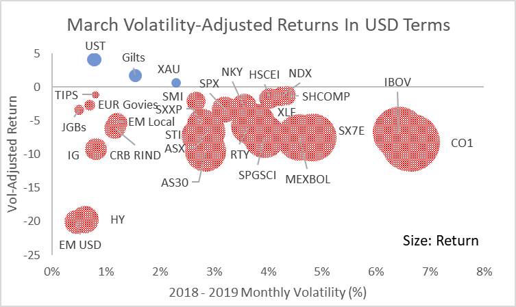
The absolute scale of the losses is, of course, dramatic, but the source of the shock to portfolios is best seen when adjusting for the normal volatility of each asset. In this case, we show all returns from the perspective of a USD-based investor (converting foreign currency assets on an unhedged basis) using monthly volatility through the 2018-2019 period as indicative of the type of risk an investor might normally have expected from each asset.
March Returns In USD Terms, adjusted for 2018 – 2019 monthly volatility; Source: Bloomberg
Although, the March shock was crushing for high volatility assets like oil, Mexican and Brazilian equities, on a volatility-adjusted basis it was significantly worse for USD-denominated high-yielding credit assets;
Credit shocks of this sort often take time to fully dissipate through the financial system. The initial wave of price destruction leaves anomalies in relative pricing that correct over weeks or possibly months;
In these circumstances, it can be helpful to consider the conditional price of an asset, eg if credit spreads accurately discount the risk of defaults, where should equities trade to balance risk-adjusted expected returns?
The commentary contained in the above article does not constitute an offer or a solicitation, or a recommendation to implement or liquidate an investment or to carry out any other transaction. It should not be used as a basis for any investment decision or other decision. Any investment decision should be based on appropriate professional advice specific to your needs.
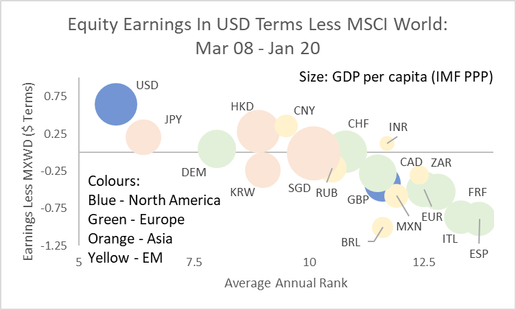
A brief retrospective on the economic cycle that peaked at the start of 2020, as condensed into one chart.
Peak / Peak Change In Earnings: countries denoted by currency mnemonics; see text for details; Source: Bloomberg, IMF
The chart shows the change in equity earnings expectations as measured by Bloomberg from March 2008 (the peak prior to the Lehman crisis) to the latest peak in January 2020. The y-axis shows the difference in earnings expectations between each country and MSCI World. The difference is calculated in USD terms at prevailing exchange rates. The x-axis shows a country’s annual average rank for earnings expectations (lowest rank equals best earnings). The size of the bubbles reflects each country’s current GDP per capita as reported by the IMF.
The chart reveals some key aspects of the last cycle:
The US was dominant – not only did it outperform through the cycle but it had the best annual average rank of all the countries (meaning its earnings growth was consistently among the highest);
Global earnings growth was highly unbalanced: apart from the US, only four of the markets shown here saw earnings expectations grow by more than the MSCI World in USD terms – of those, three were in Asia;
It was a terrible cycle for Europe: earnings performance was consistently poor for the euro area in aggregate, as the corporate sector in southern Europe went through an aggressive deleveraging; the large divergence between Germany and the southern European countries highlights an unresolved internal pressure.
Although only coined in the second half of the cycle, “America First” was an accurate epithet.
Implicit rather than explicit in the chart is the result for portfolio positioning. Although seemingly paradoxical, for many, the culmination of two decades of globalisation has been increased concentration on a single equity market.
Why did this happen? Three factors in particular stand out:
Globalisation was broad, deep and powerful: its most extreme beneficiaries were the owners of capital relative to unskilled labour in developed economies, in particular;
Technological change allowed the effects of globalisation to extend further and faster than historical parallels would have suggested: winner-takes-all innovations provided significant market power to those able to build initial market share;
Monetary policy – especially US monetary policy – was dominant: the central bank reaction to the 2008 crisis was to err towards providing more than enough liquidity to ensure that new sources of credit stress could not gain traction; with money velocity depressed, the result was the maintenance of low yields that enhanced the present value of tech companies’ long-dated earnings expectations.
Each of these factors seems set to weaken or be replaced in the coming cycle, with potentially significant consequences for how long-dated asset owners’ portfolios should be structured.
The commentary contained in the above article does not constitute an offer or a solicitation, or a recommendation to implement or liquidate an investment or to carry out any other transaction. It should not be used as a basis for any investment decision or other decision. Any investment decision should be based on appropriate professional advice specific to your needs.
Navigating the intersection between price and value
“What’s in the price?” is a common question for investors. It means, “What expectations for future events are discounted in the current price?” But, in times of crisis, it pays to take a step back and ask a more basic question, “What really is the price for?”
Normal assumptions about market depth or the extent to which a transaction might influence market prices break down;
Relationships between normally closely-linked assets are undermined as extreme levels of volatility or balance sheet constraint remove the capacity to arbitrage;
Perhaps most strikingly, we see that the price of assets embedded in an institutional structure can be wildly different if the liquidity of the structure and the assets diverge.
For a time, the price of liquidity comes to dominate any other market signal.
Closed end funds are designed to capture a particular investment theme or segment of the market. The fund manager issues a fixed number of shares and uses the proceeds to invest in securities according to the mandate of the fund. Arbitrage-free pricing would suggest that the price of the fund should align with the net asset value of its securities. However, in practice, this relationship is subject to significant change through time, with sizeable discounts evident during periods of extreme market uncertainty, as at present.
In our earlier analysis, we considered 50 funds representative of the closed end sector as a whole with more than five years of price history as of 2015. Taking the same funds as used in the original analysis (with the exception of a couple which had been bought out in the intervening period) shows that the average discount during the last week was similar to the most extreme points of the 2008 crisis.
Average Closed End Fund Discount: 50 Funds – see text for details; Source: Bloomberg
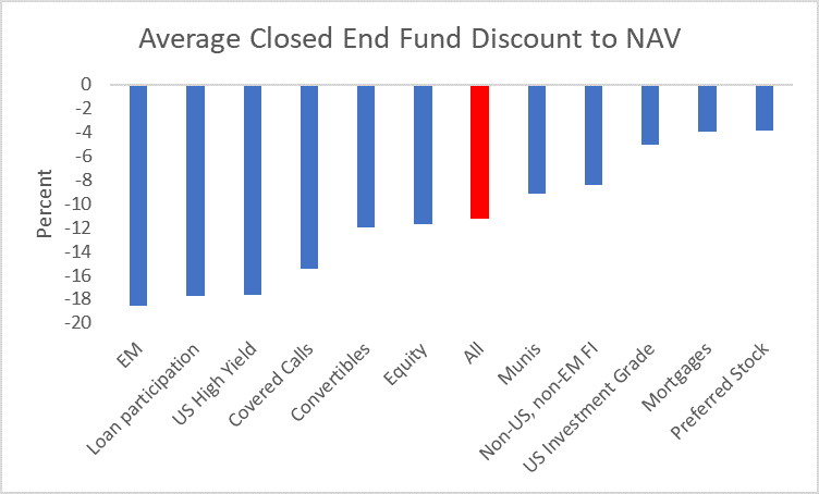
It would be wrong to see this extreme bifurcation between the price of assets as marked in the market and as signalled by the price of the closed end funds themselves as a sign of random malfunction. Instead, the sectors with the largest divergences in prices are the ones where assets are most likely not to be trading or where uncertainty over the sustainability of income streams as a result of the shock from the coronavirus is greatest.
Sector Average For Closed End Fund Discount; March 25 2020; Source: Bloomberg
This can be seen, for instance, in abnormally large difference between the discounts for US Investment Grade funds and those for High Yield funds.
Average Sector Discount: US High Yield Less US Investment Grade; Source: Bloomberg
Hence, the price signal from the discounts in closed end fund is twofold:
It is a signal of the price of liquidity today, and
A signal of the location of potential future value if macro conditions improve
The commentary contained in the above article does not constitute an offer or a solicitation, or a recommendation to implement or liquidate an investment or to carry out any other transaction. It should not be used as a basis for any investment decision or other decision. Any investment decision should be based on appropriate professional advice specific to your needs.