March Returns

Two charts summarise the extreme destruction of value seen in March.

March Local Currency Returns – see text for details; Source: Bloomberg

The first chart shows the local currency returns of a selected sample of assets across fixed income, equities and commodities. Fixed income returns are from Barclays’ indices, while all other assets are shown with their Bloomberg tickers for convenience. Returns shown are in local currency terms (in USD for commodities).

The chart reveals two key features of March’s shock:

  • The imbalance between the number of assets generating positive returns and those suffering losses: safe havens were few and far between and, for the month as a whole, provided a very modest offset against the losses elsewhere;
  • The severity of the losses for commodities and commodity producers, bank stocks as well as cyclical assets which had been priced for growth (eg RTY: the Russell 2000).

The absolute scale of the losses is, of course, dramatic, but the source of the shock to portfolios is best seen when adjusting for the normal volatility of each asset. In this case, we show all returns from the perspective of a USD-based investor (converting foreign currency assets on an unhedged basis) using monthly volatility through the 2018-2019 period as indicative of the type of risk an investor might normally have expected from each asset.

March Returns In USD Terms, adjusted for 2018 – 2019 monthly volatility; Source: Bloomberg
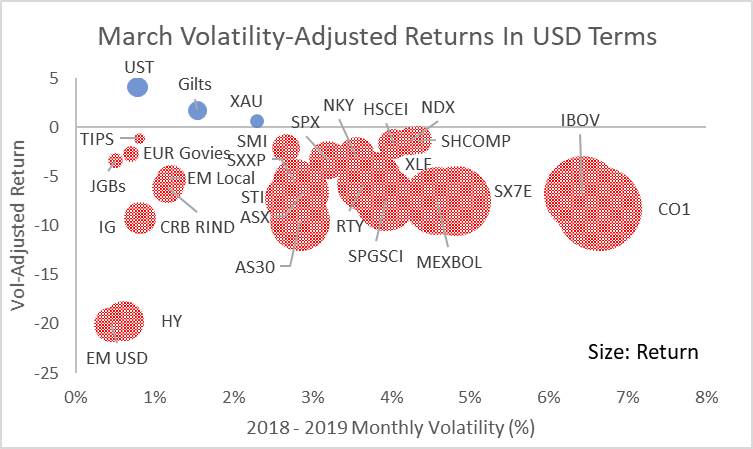
  • Although, the March shock was crushing for high volatility assets like oil, Mexican and Brazilian equities, on a volatility-adjusted basis it was significantly worse for USD-denominated high-yielding credit assets;
  • Credit shocks of this sort often take time to fully dissipate through the financial system. The initial wave of price destruction leaves anomalies in relative pricing that correct over weeks or possibly months;
  • In these circumstances, it can be helpful to consider the conditional price of an asset, eg if credit spreads accurately discount the risk of defaults, where should equities trade to balance risk-adjusted expected returns?

The commentary contained in the above article does not constitute an offer or a solicitation, or a recommendation to implement or liquidate an investment or to carry out any other transaction. It should not be used as a basis for any investment decision or other decision. Any investment decision should be based on appropriate professional advice specific to your needs.

The last cycle

A brief retrospective on the economic cycle that peaked at the start of 2020, as condensed into one chart.

Peak / Peak Change In Earnings: countries denoted by currency mnemonics; see text for details; Source: Bloomberg, IMF

The chart shows the change in equity earnings expectations as measured by Bloomberg from March 2008 (the peak prior to the Lehman crisis) to the latest peak in January 2020. The y-axis shows the difference in earnings expectations between each country and MSCI World. The difference is calculated in USD terms at prevailing exchange rates. The x-axis shows a country’s annual average rank for earnings expectations (lowest rank equals best earnings). The size of the bubbles reflects each country’s current GDP per capita as reported by the IMF.

The chart reveals some key aspects of the last cycle:

  • The US was dominant – not only did it outperform through the cycle but it had the best annual average rank of all the countries (meaning its earnings growth was consistently among the highest);
  • Global earnings growth was highly unbalanced: apart from the US, only four of the markets shown here saw earnings expectations grow by more than the MSCI World in USD terms – of those, three were in Asia;
  • It was a terrible cycle for Europe: earnings performance was consistently poor for the euro area in aggregate, as the corporate sector in southern Europe went through an aggressive deleveraging; the large divergence between Germany and the southern European countries highlights an unresolved internal pressure.

Although only coined in the second half of the cycle, “America First” was an accurate epithet.

Implicit rather than explicit in the chart is the result for portfolio positioning. Although seemingly paradoxical, for many, the culmination of two decades of globalisation has been increased concentration on a single equity market.

Why did this happen? Three factors in particular stand out:

  • Globalisation was broad, deep and powerful: its most extreme beneficiaries were the owners of capital relative to unskilled labour in developed economies, in particular;
  • Technological change allowed the effects of globalisation to extend further and faster than historical parallels would have suggested: winner-takes-all innovations provided significant market power to those able to build initial market share;
  • Monetary policy – especially US monetary policy – was dominant: the central bank reaction to the 2008 crisis was to err towards providing more than enough liquidity to ensure that new sources of credit stress could not gain traction; with money velocity depressed, the result was the maintenance of low yields that enhanced the present value of tech companies’ long-dated earnings expectations.

Each of these factors seems set to weaken or be replaced in the coming cycle, with potentially significant consequences for how long-dated asset owners’ portfolios should be structured.

The commentary contained in the above article does not constitute an offer or a solicitation, or a recommendation to implement or liquidate an investment or to carry out any other transaction. It should not be used as a basis for any investment decision or other decision. Any investment decision should be based on appropriate professional advice specific to your needs.

The price of liquidity

Navigating the intersection between price and value

“What’s in the price?” is a common question for investors. It means, “What expectations for future events are discounted in the current price?” But, in times of crisis, it pays to take a step back and ask a more basic question, “What really is the price for?”

  • Normal assumptions about market depth or the extent to which a transaction might influence market prices break down;
  • Relationships between normally closely-linked assets are undermined as extreme levels of volatility or balance sheet constraint remove the capacity to arbitrage;
  • Perhaps most strikingly, we see that the price of assets embedded in an institutional structure can be wildly different if the liquidity of the structure and the assets diverge.

For a time, the price of liquidity comes to dominate any other market signal.

Updating some analysis I co-authored with Honglin Jiang and Bill Papadakis in 2015 helps to show this.

Closed end funds are designed to capture a particular investment theme or segment of the market. The fund manager issues a fixed number of shares and uses the proceeds to invest in securities according to the mandate of the fund. Arbitrage-free pricing would suggest that the price of the fund should align with the net asset value of its securities. However, in practice, this relationship is subject to significant change through time, with sizeable discounts evident during periods of extreme market uncertainty, as at present.

In our earlier analysis, we considered 50 funds representative of the closed end sector as a whole with more than five years of price history as of 2015. Taking the same funds as used in the original analysis (with the exception of a couple which had been bought out in the intervening period) shows that the average discount during the last week was similar to the most extreme points of the 2008 crisis.

Average Closed End Fund Discount: 50 Funds – see text for details; Source: Bloomberg

It would be wrong to see this extreme bifurcation between the price of assets as marked in the market and as signalled by the price of the closed end funds themselves as a sign of random malfunction. Instead, the sectors with the largest divergences in prices are the ones where assets are most likely not to be trading or where uncertainty over the sustainability of income streams as a result of the shock from the coronavirus is greatest.

Sector Average For Closed End Fund Discount; March 25 2020; Source: Bloomberg

This can be seen, for instance, in abnormally large difference between the discounts for US Investment Grade funds and those for High Yield funds.

Average Sector Discount: US High Yield Less US Investment Grade; Source: Bloomberg

Hence, the price signal from the discounts in closed end fund is twofold:

  • It is a signal of the price of liquidity today, and
  • A signal of the location of potential future value if macro conditions improve

The commentary contained in the above article does not constitute an offer or a solicitation, or a recommendation to implement or liquidate an investment or to carry out any other transaction. It should not be used as a basis for any investment decision or other decision. Any investment decision should be based on appropriate professional advice specific to your needs.