Real forward exchange rates: investable valuation metrics

We consider the utility of the real forward exchange rate as an investable valuation metric, focusing on a number of EM Latin American countries to demonstrate the application of the concept for a USD or GBP-based investor. We show why we think the metric is useful both as a gauge of all-in risk premiums, a guide to the timing of investments and as a way to consider the appropriate risk bucket for the underlying assets.

The real exchange rate adjusts for changes in the general level of prices between countries, thereby providing a tractable benchmark for currency pairs affected by a persistent imbalance in the level of inflation. In the same way that a forward exchange rate discounts interest differentials between countries over a certain period of time, a real forward exchange rate can be constructed using the combination of the real exchange rate and real interest rate differentials.

The chart below shows the concept for USDBRL. We rebase the spot real exchange rate to equal 100 in 2004, generating a real forward exchange rate based on the compounded real interest rate differentials between Brazil and the US.

USDBRL: real exchange rate, real yield spreads and real forward exchange rate; Source: Bloomberg

At any point in time, what the measure captures is the ability for a holder of an inflation-linked bond in the US to sell the bond, exchange the dollar proceeds for Brazilian real and to use those proceeds to buy a Brazilian inflation-linked bond. The investor is compensated for increases in Brazilian CPI for the remaining lifetime of the bond, providing something of a cushion against declines in the nominal exchange rate, with the higher level of real yields compensating for a combination of higher default risk, greater return correlation to risky assets in economic downturns as well as the risk of a depreciation of the real exchange rate before the principal is repaid.

Although this is the purest application of the concept, regulatory constraints on many holders of inflation-linked bonds reduce the number of investors who would consider this type of transaction in practice. We therefore complement it with a simpler variant in which we show the combination of the real exchange rate and the real yield of the higher-yielding market. The resulting hybrid measure shows the protection for a cash investor in the lower-yielding currency assuming that their investment alternative would be to hold a zero real-yield asset in their domestic currency. In practice, this might either be too low or too high, depending on the domestic monetary policy regime in place, but the approach has the merit of isolating the contribution of the higher yielding asset to the investment decision. We label this hybrid measure ‘cash investor’s protection’ in the charts below.

In the chart below, we show the application of the two concepts to USDMXN. The impact of the US monetary policy regime on the difference between the real forward exchange rate and the ‘cash investor’s protection’ is readily apparent: prior to the 2008 crisis when US real interest rates were consistently positive, the assumption of zero US real interest rates in calculation of the ‘cash investor’s protection’ has the effect of boosting that measure well above the forward. By contrast, post-crisis, with US real interest rates close to zero most of the time, the difference between the two metrics has typically become relatively modest.

USDMXN real exchange rate and two alternative forward measures: see text for details; Source: Bloomberg

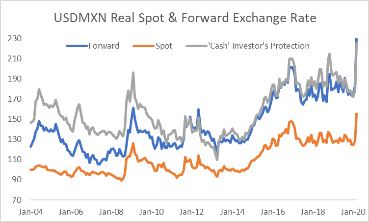
In the UK, because the impact of regulation on investor behaviour has become increasingly influential in depressing inflation-linked yields relative to other countries, the difference between the two measures has, by contrast, become increasingly substantial.

GBPMXN: real exchange rate and two alternative forward measures – see text for details; Source: Bloomberg

The chart above is also notable for the fact that the GBPMXN real exchange rate has exhibited far greater stability than the USDMXN real exchange rate.

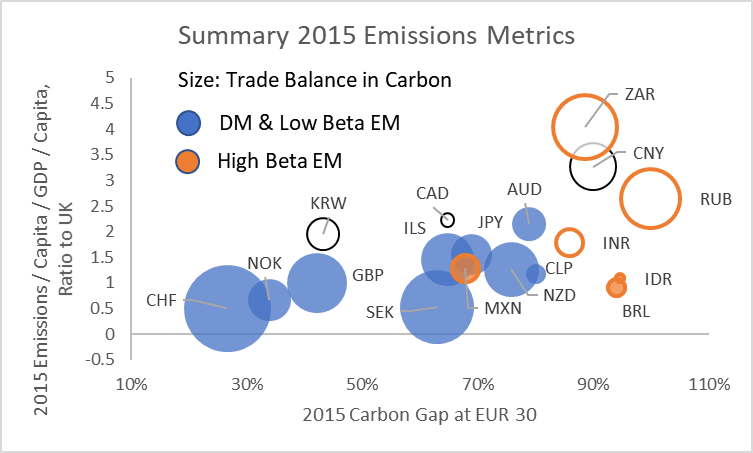
We consider two primary drivers of the real exchange rate: the first is productivity, given the expectation that low income countries will experience faster domestic services inflation as their productivity rises and income levels converge with higher income countries; the second is current and expected terms of trade, particularly for countries with high exposure to commodities.

The chart below compares the USDMXN real exchange rate with two measures of productivity: the first is based on Total Factor Productivity growth differentials as reported in the Penn World Tables while the second shows changes in GDP per capita at PPP exchange rates, as reported by the IMF.

US vs Mexico: real exchange rate and productivity measures; Sources: Bloomberg, Penn World Tables, IMF

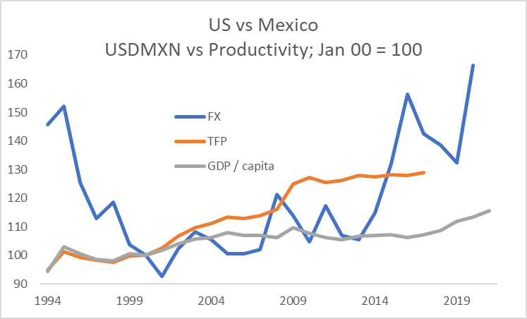
Depending on the metric used, over the period since 2000, the US has seen an improvement of productivity versus Mexico of 15-30%. As of the end of April 2020, the USDMXN real exchange rate had appreciated by just over 65% since 2000. The extent of the peso’s depreciation likely reflects some combination of market judgment that sustainedly lower oil prices may require a weaker Mexican real exchange rate relative to its historic level as well as the discount required on all riskier assets during a period of extreme uncertainty over activity and income levels.

We show two ways of evaluating performance.

For the first, we construct an equally-weighted index based on Mexican, Brazilian and Chilean inflation-linked bonds, using the returns from the Barclays indices. Considering all the assets at 10% volatility, we then compare the returns with US TIPS, US High Yield credit and the MSCI World financials index, all expressed in unhedged USD terms.

LatAm inflation-linked bond unhedged returns in USD compared with selected assets; Source: Bloomberg

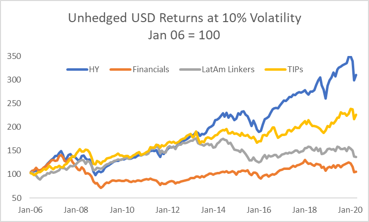
We can make three clear observations from the returns history:

  • All of the assets saw a substantial repricing during the 2008 crisis; in contrast to the others, global financials struggled to recover as capital needs and the regulatory costs associated with the business increased (less apparent from the chart but nonetheless the case is that LatAm linkers have delivered a similar return profile at 10% volatility to global financials since 2016);
  • Until 2013-2014, the return profile for LatAm inflation-linked bonds in USD terms was readily comparable with US High Yield and TIPS; the subsequent bifurcation likely reflected a combination of (I) the end of China’s commodity binge, (II) the oil market collapse in 2015; (III) Brazil’s financial crisis, and (IV) the upward shift in USD real rates and the dollar itself as the Fed moved away from emergency settings for interest rates and US fiscal policy become highly stimulatory under President Trump;
  • Even allowing for the occasionally large drawdowns, the returns from leveraged US credit have been competitive with almost all other major asset classes through the period.

Instead of constant exposure to the asset class, we now consider the merits of using the forward real exchange rate as a valuation indicator. In the charts below, we show two different investment cases for a USD-based and a GBP-based investor:

  • In the first case, we show unhedged Mexican inflation-linked bond returns less US or UK CPI relative to the real spot exchange rate and the ‘cash investor’s protection’ rate as an indication of whether Mexican inflation-linked bonds delivered a positive return in real USD or GBP terms over the subsequent two year period (we selected two years in all cases as an indicative period for mean-reversion of the real exchange rate and reduction in risk premiums through the cycle, making no attempt to optimise the holding period);
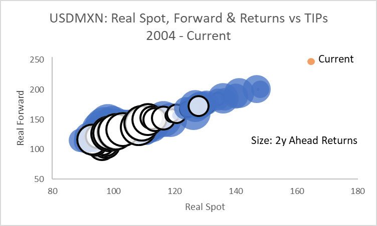
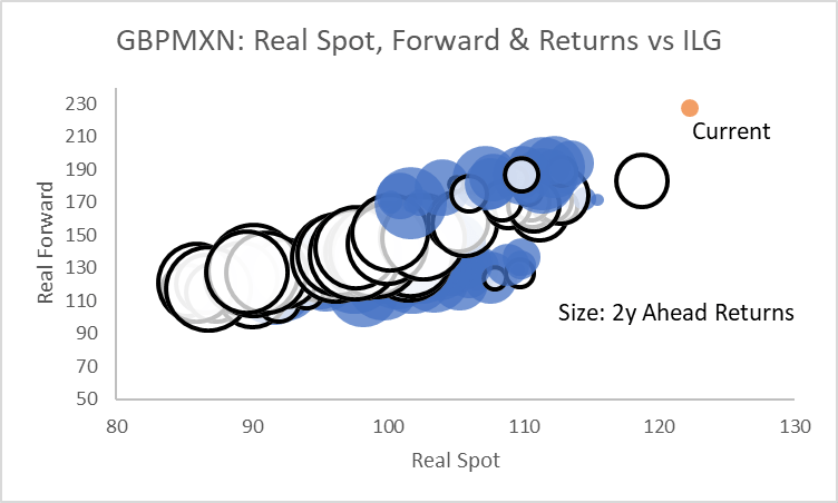
  • In the second case, using the real spot and forward exchange rates, we consider the more challenging hurdle of whether Mexican inflation-linked bonds outperformed domestic inflation-linked bonds over the subsequent two year period.

The two charts below show the case for a US-based investor. The blue bubbles indicative a positive return over US CPI for a USD-based investor, the white bubbles a negative return. Given a two year investment period, the clear indication from the chart is that the combination of the real spot and forward rate helps to identify the conditions under which positive returns in real USD terms are more likely to be delivered. The ‘Current’ point in each of the remaining charts refers to end-April 2020.

Unhedged USD returns for Mexican inflation-linked bonds; see text for details; Source: Bloomberg

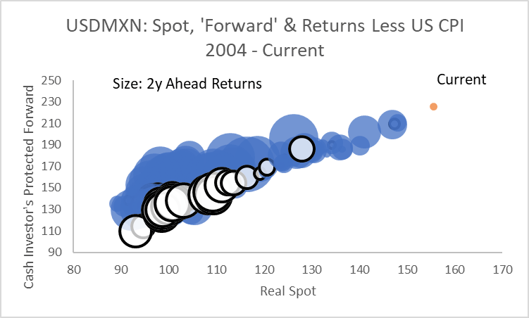
By contrast, it is less apparent whether the construct is useful in identifying whether Mexican inflation-linked bonds will outperform TIPS in unhedged USD terms.

Return comparison: Mexican inflation linked bonds less TIPS; see text for details; Source: Bloomberg

These conclusions are reinforced when extending the analysis for a GBP-based investor.

Because the GBPMXN real exchange rate has been largely stable, the combination of the real spot and ‘cash investor’s protection’ rate have helped identify the conditions under which Mexican inflation-linked bonds are likely to deliver a positive return in real GBP terms over the subsequent two years.

Unhedged GBP returns for Mexican inflation-linked bonds; see text for details; Source: Bloomberg

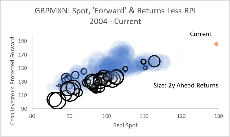
However, over the period considered, it has almost always been a losing proposition to sell inflation-linked gilts relative to Mexican inflation-linked bonds, regardless of the starting-point for the real exchange rate.

This analysis helps draw out a number of different components of the investment decision for EM inflation-linked bonds:

  • EM inflation-linked bonds can deliver competitive returns for foreign investors;
  • However, for many G10 investors, they are best considered as part of the risky asset bucket – they cannot compete with long duration domestic bonds in an environment of deteriorating growth;
  • Similar to risky assets overall, a dynamic approach is best in determining the appropriate level of exposure through the cycle;
  • Analysis of the real exchange rate and appropriately-defined forwards has historically helped define the conditions under which these assets are most likely to perform;
  • Nonetheless, this does not do away with idiosyncratic policy decisions or risks from sudden institutional changes;
  • Looking forward, an investor’s judgment on the drivers of the real exchange rate and the outlook for an individual country’s creditworthiness can be used to help determine whether the compensation for risk offered by current entry points are sufficiently attractive or not.

The commentary contained in the above article does not constitute an offer or a solicitation, or a recommendation to implement or liquidate an investment or to carry out any other transaction. It should not be used as a basis for any investment decision or other decision. Any investment decision should be based on appropriate professional advice specific to your needs.

April returns and fundamentals

A brief annotation of the bifurcation between April’s market recovery and the underlying deterioration in fundamental conditions, summarised in six charts.

The underlying hit to growth expectations continued to build as the first post-lockdown data were released.

Consensus forecasts: 1y ahead global GDP growth and corporate earnings; Source: Bloomberg

Since the beginning of March, the change in earnings expectations has been particularly severe for US cyclicals and European banks. Adjusted for the longer term volatility of expectations, the change at the broad index level in the US and Europe has been greatest.

Change in 1y ahead earnings estimates since March 1 2020 in absolute terms and adjusted for
post-2005 monthly volatility; Source: Bloomberg

The market traded liquidity in preference to fundamentals in April. Looking at performance across March and April, the clearest beneficiaries from central bank liquidity were Treasuries, long duration equities (last cycle’s winners) and gold. Commodities and European banks failed to benefit much if at all.

Unhedged USD returns adjusted for 2018-2019 volatility; Source: Bloomberg

The effects of the central bank liquidity injections and asset purchases on the demand for protection against further asset market shocks was evident in the large-scale retracement of the earlier surge in implied volatility. The chart shows the cumulative Z-score based on data since 2001.

Other measures of liquidity risk in many cases improved further. Our measure of the closed end fund discount has not fully recovered from its March collapse, but has returned to levels that suggest much greater confidence in the pricing of assets and the ability to generate cash from less liquid holdings if required.

Average Closed End Fund Discount; see text link for details of construction; Source: Bloomberg

The effects of the Federal Reserve’s interventions were particularly notable in the US High Yield market to the extent that the discount for funds in that sector relative to Investment Grade funds is now towards the tightest it has traded at since 2015.

Average sector discount for High Yield less Investment Grade closed end funds; see link in text for
construction details; Source: Bloomberg

Carbon in a macro portfolio

We explore the merits of different approaches to tracking carbon as a source of returns in a macro portfolio, concentrating on equity and FX markets.

Whereas the sector concentration of CO2 emissions makes it relatively easy to identify a high-level carbon factor in equities, FX is more challenging. We expose the ways in which construction of a carbon FX portfolio requires the integration of EM currencies and therefore careful risk management of non-carbon factors.

Our intention is to build towards a cross-asset expression of carbon in a macro portfolio. The approach we use is to identify summary financial exposures that an investor can monitor in expressing carbon as a theme and to define those exposures parsimoniously.

In starting, we summarise the building blocks we use in constructing a theme using asset returns:

  • Themes are designed to give constant exposure to a driver of asset returns;
  • They an be comprised of outright or long/short asset exposures;
  • They are constructed such that each exposure has 10% volatility to prevent returns from higher volatility assets dominating the signals from lower volatility assets;
  • The investor has constant exposure to a theme regardless of prior losses or profits made;
  • Representations are designed to be generic to capture the essence of the return stream rather than favouring niche expressions that may be dominated by idiosyncratic factors.

Taking a well-known example in the form of cyclical assets to demonstrate one set of applications of the approach:

  • Cyclical upswings are periods of increased economic optimism, rising demand for capital and growing willingness to take market risk;
  • Hence, in a cyclical upswing, real interest rates would typically be expected to come under upward pressure;
  • Inflation expectations generally rise in phases of cyclical strength;
  • Equities would usually be expected to outperform bonds;
  • Credit spreads would normally compress;
  • High-yielding currencies would typically outperform low-yielding currencies.

Hence, in the cyclicals theme whose returns we show later, the investor is short inflation-linked bonds, long breakevens, long equities versus Treasuries, long credit, long the cyclical component of the equity market as well as long high-yielding currencies funded in safe-haven currencies. This is not necessarily the best combination for all cyclical upswings or indeed all parts of an upswing. However, it serves to capture a generic cyclical momentum across markets.

Taking this as a base, what considerations should inform our thinking about carbon in a macro portfolio?

  • Although policy change to achieve carbon-reduction targets over time could have very significant implications for asset allocation decisions and desired country exposures, we think it easiest, in the first instance, to consider carbon as a relative price factor;
  • In particular, policy is increasingly oriented towards encouraging the market to devalue activities that are intense in carbon production relative to those that are not;
  • Hence, we focus on a series of long/short exposures: investors are long low carbon-producing sectors relative to carbon-intense sectors while being long currencies of low emitters or of economies in which activities have adjusted to a price of carbon consistent with public policy objectives;
  • We use OECD data to isolate the carbon intense sectors (utilities, oil and gas along with metals and mining) and define exposure such that the investor is short those sectors relative to the MSCI World.

The chart below shows the summary return stream from this long/short equity exposure:

Returns from the equity market versus high carbon assets; see text for details; Source: Bloomberg

The chart identifies two very distinct periods for the exposure:

  • Through the commodity super-cycle, the strategy was disastrous: the strength of China’s demand for commodities caused the market to judge that income streams from carbon-producing sectors were increasingly valuable, the opposite of what the strategy seeks to gain exposure to;
  • By the start of the 2010s, however, the cycle turned and, as China’s dash for commodity-intensive growth abated, so did the relative weight of carbon-producing sectors in global equity markets;
  • The result was a return history for the strategy of large extremes.

To identify potential candidates for expressing the same theme in FX, we adopted a metric based on CO2 emissions relative to per capita GDP. The chart below shows, for selected countries, that the relative country rankings are stable even though the overall level of emissions per unit of GDP have trended lower.

Carbon emissions per capita / GDP per capita; ranked versus UK 2010; see text for details; Source: OECD

Taking the extremes from this group of countries to allow a long/short portfolio to be structured, we first consider the relationship between the relative price of carbon as measured by equity market returns and FX.

CPI-based real exchange rates (Jan 2014 = 100) versus carbon equity theme returns; Source: Bloomberg

The chart shows that there is a long run relationship between the real exchange rates of the chosen pairs and the equity theme. Indeed, this is a well known channel in FX analysis: given that both Australia and South Africa are commodity exporters, while Switzerland is a commodity importer, we would expect that the equity returns embedded in the carbon equity theme would act as a proxy for the terms of trade in commodities.

Regrettably, this is not sufficient for the construction of a profitable FX strategy, however. As shown in the chart below, the persistently higher level of interest rates in Australia and South Africa compared with Switzerland either neutralise or dominate the prospective long run return stream coming from the relative pricing of carbon.

FX carry return for strategies long CHF versus short AUD and ZAR, respectively; Source: Bloomberg

We adopt two approaches in seeking to address these problems:

  • We use more recent and detailed metrics for assessing countries’ carbon exposure; and
  • We actively seek to control for non-carbon risks using a portfolio of both developed (DM) and emerging market (EM) currencies.

The chart below summarises a number of metrics compiled by the OECD on carbon emissions.

CO2 emissions on various OECD metrics – see text for details; Source: OECD

The chart displays the following:

  • The x-axis shows the OECD’s measure of the carbon gap: a way of measuring the proportion of economic activity within a country that reflects carbon prices at or above certain levels judged to be consistent with long run climate pledges – the lower the gap, the more competitive is economic activity in a country assuming that carbon prices adjust to the level required to contain global warming;
  • The y-axis shows emissions per capita, with all countries shown as a ratio to the UK purely for the purpose of easy visual comparison;
  • The size of the bubbles shows the OECD’s estimate of whether a country is a carbon exporter (bubbles with a white centre) or importer (coloured) as embedded in the goods it trades – the size of the bubble shows the size of the country’s exposure to net trade;
  • Finally, we distinguish high beta EM currencies from other currencies because they typically suffer both weaker currencies and higher interest rates in a period of risk aversion, thereby creating a higher volatility return structure.

How might we consider these metrics in forming a carbon FX portfolio?

  • First, early adjustment to higher carbon prices should, in principle, be a source of competitive advantage, with those countries standing to benefit as policies in other countries converge over time;
  • Second, large net exporters of carbon embedded in goods trade are prospectively particularly exposed to changes in other countries’ policies regarding carbon pricing, eg through carbon border taxes;
  • Third, any meaningful FX portfolio exposure to carbon needs to consider how to manage EM risk.

In addition to these considerations, the approach we take seeks to adjust to the natural grains of the FX market:

  • We select currencies such that the portfolio has no net dollar exposure given the dominance of the dollar factor in pricing currency risk independent of carbon exposure;
  • We seek to limit exposure to managed currencies and in particular elect not to include China in the portfolios because of the amplified effect its currency moves can have on other EM currencies;
  • We seek to balance out risk exposure between currency pairs with otherwise similar risk exposures, eg to safe haven flows, carry, cyclical risk or EM beta risk;
  • Nonetheless, investors should bear in mind that EM assets naturally reflect a higher level of idiosyncratic risk than DM and that this may periodically overwhelm the desired carbon exposure.

The chart below summarises the performance of three different portfolios. The portfolios are based on slow-moving information that is published with a long lag, hence returns should be treated as purely indicative, with the merit of the inputs in selecting currency exposure better gauged over the coming economic cycle. Some investors may seek to implement an active management overlay to allow, for example, within-bucket risk reallocation based on other valuation metrics whilst retaining the same directional exposure to carbon.

FX long/short carbon portfolios – see text for details on construction; Source: Bloomberg

Finally, we combine the mixed FX portfolio with the equities carbon theme shown above to demonstrate the concept of a cross-asset carbon theme, comparing the resulting return streams in comparison with our cyclicals theme and the S&P 500, all at 10% volatility.

Returns to selected themes and the S&P 500 at 10% volatility – see text for construction; Source: Bloomberg